Data
Data
The Data tab lets you view and analyze recorded data. It contains 2 types of data: "New data" and "Associated data".
New data
"New data" is raw data that is not associated with a user. Click the double arrow ↔ to associate it. A small cloud in place of the double arrow means that the data has not yet been retrieved from the Maxi-Phyling: click it and wait for the data to be downloaded so you can associate it.
For a Maxi-Phyling, the data is listed in order; if the time of the recording was not saved, a "?" is displayed in place of the time. The Hub automatically retrieves the latest recording if it is less than 3 hours old; the other recordings appear with a small cloud in place of the double arrow.

Association consists of annotating the recording by indicating the user who made it and, optionally, adding other information (exercise, comment, etc.) that may be needed to process it.
Association also triggers the calculation of all the indicators specific to the sport of the recording. With the "Default" sport, no analysis is performed, which allows you to view the raw data.
Associated data
Once the data is associated, it appears in the main table of the Data tab. You can then view it, but also download it in .csv, .txt, etc. format or generate a pdf analysis report.

If a recording shows an exclamation mark instead of the small eye for viewing, it means that the calculations did not complete correctly and there may be a problem with the data. You can rerun the analysis with another sport. Use the "Default" sport to view the raw data.
You can load a data file retrieved from a Maxi-Phyling over USB by clicking the "Import" button above the data table. A window opens where you can select the file to import and enter the associated information.
Downloading data and pdf reports
To download the data, click the download icon next to the recording. Then choose the export type (raw data in txt format, processed data in csv format, pdf report, etc.). To download a pdf report, you must also specify the selection.
Visualization
To view the data of a recording, click the small eye or double-click the file's row. Visualization panels can be predefined depending on the analysis modules. The "All" panel lets you view all the calculated data.
For visualization, you can choose the x-axis (time T by default) and 2 different y-axes to view two types of data with different orders of magnitude.
All the data that can be displayed is available in the drop-down menu. There may be gaps in the data if one of the sensors required to collect the data was not connected.
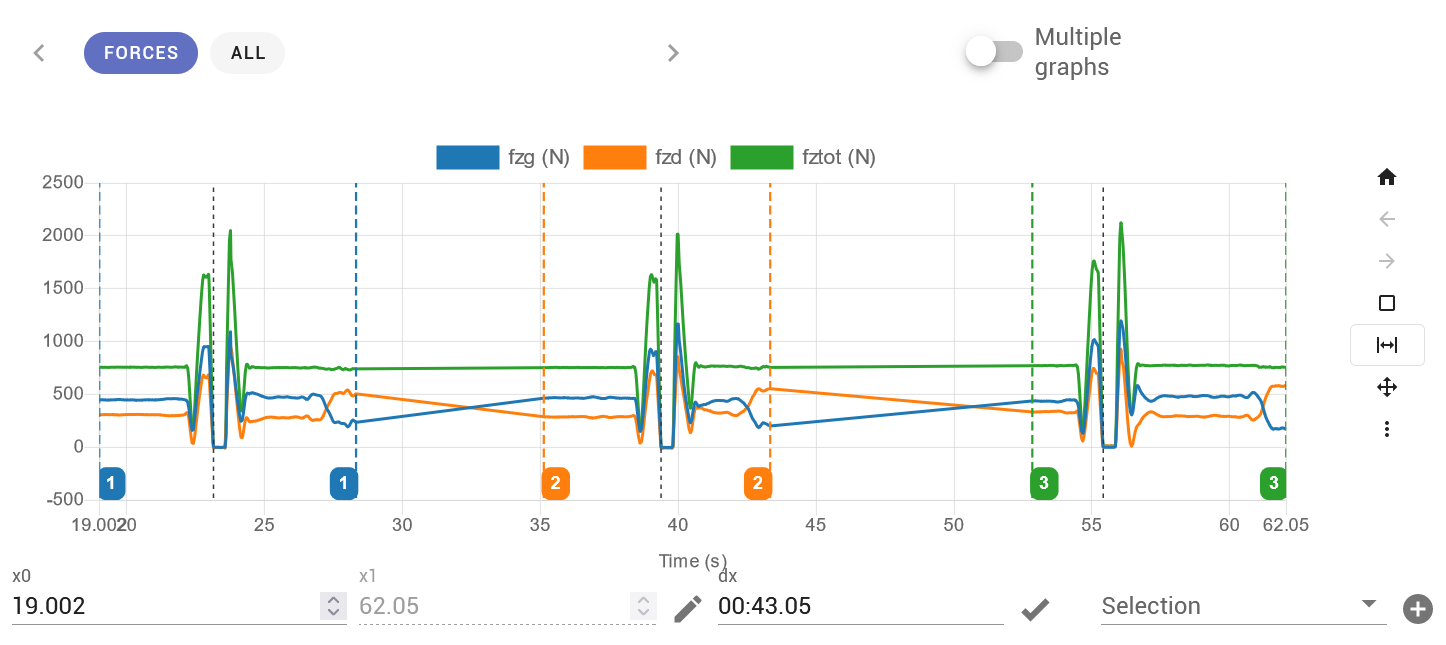
Selections
During visualization, you can create selection areas. These selections make it possible to run a finer analysis and calculate markers targeted at parts of the recording, or simply to set reference points for later visualization.
To create a selection, frame the area to select on screen, then click the + button below the graph, to the right of the Selection drop-down menu. The markers are calculated automatically and the statistics tables are displayed below the graph.
Calibration
A recording can be recalibrated by clicking the Recalibrate button, available from the buttons to the right of the visualization or when you rerun an analysis. The format of the calibration file is described in detail here.
Comparison
A comparison module lets you compare the data of selections contained in one or more recordings. Select the recordings in the main table, then click the comparison button above the table. A window opens where you choose the selections to compare and the variables to display.